
In March of 2020, the COVID-19 pandemic forever changed the way we live–and shop. As stores were closing and people were social distancing, curbside pickup grew exponentially overnight. According to CNBC, the number of curbside pickup orders placed at retail stores surged 208% in April of 2020 (as compared to data from April 2019).
Kroger store associates were suddenly struggling to keep up with the influx of pickup customers. Knowing which customers were already en route to the store would help them know which orders to prioritize. My work on this product was a crash course in systems thinking, agile methodology, prioritizing immediate value through the delivery of an MVP, and iterating based on learnings to continuously improve a process that ultimately had a positive impact on customers, the business, and public health.


.png)
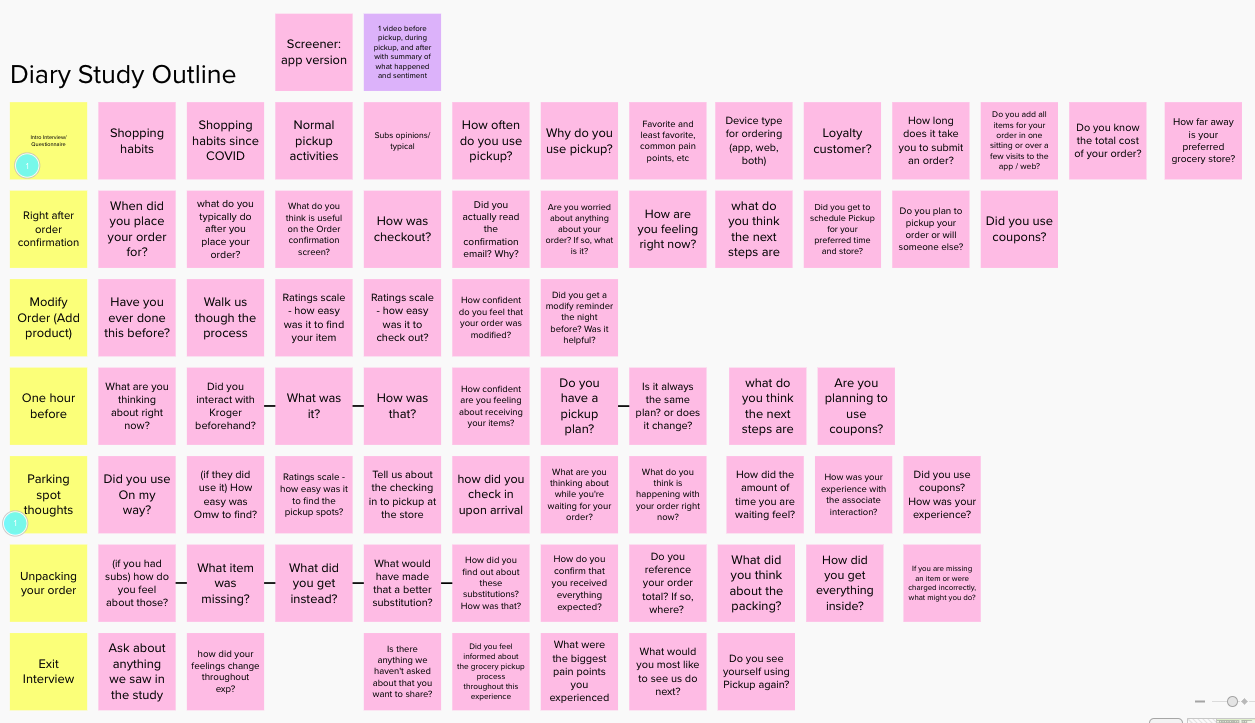
12 study participants, all of whom were:
We asked these participants to record a video diary (or "vlog") of themselves during every touchpoint of the pickup process:
In addition to the videos, the shoppers also participated in intro interviews and exit interviews, and completed a survey. The three of us set up the study and wrote the interview questions. The UX researcher conducted the interviews, while the other product designer and I observed, took notes, and collaborated on synthesis.
The study was conducted in Q3 of 2020. The planning, setup and sourcing of participants took about 1 week, the study itself took about 1 week, and the synthesis and analysis took about another week.
Participants were located all over the United States; they uploaded their videos into a OneDrive and we conducted the interviews remotely over Zoom.
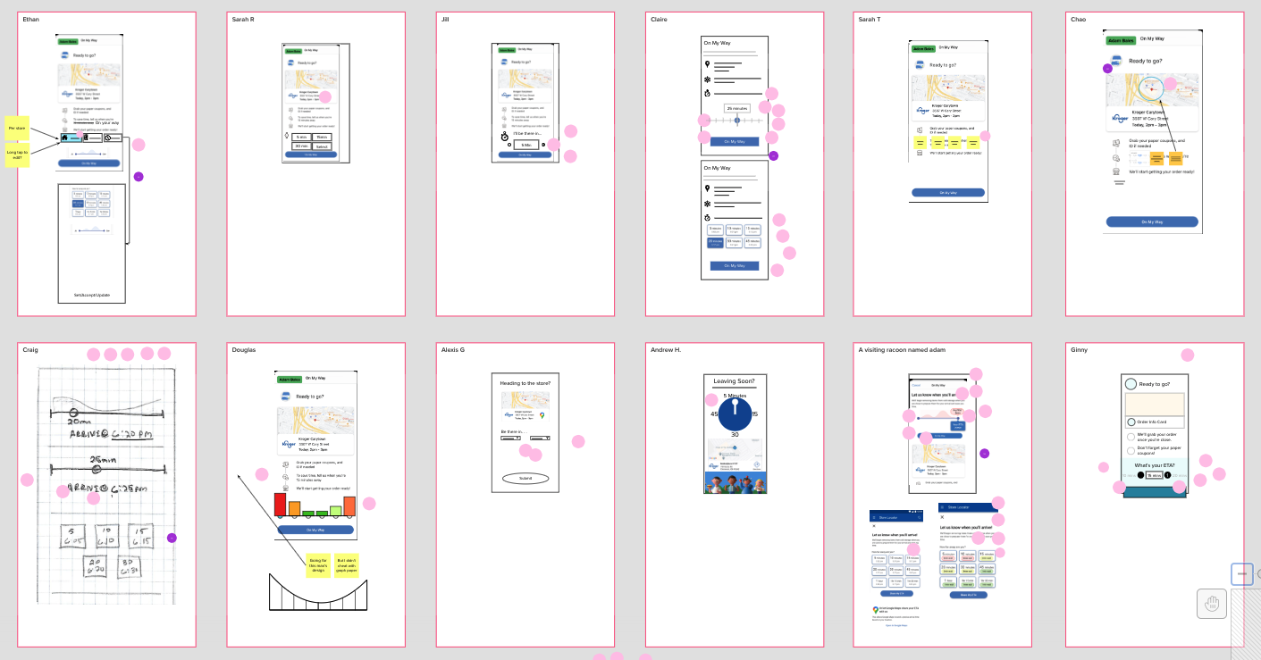
We gathered many insights from our Diary Study panel, but one that we decided to focus on for the immediate future revolved around the "On My Way" screens. We learned that the "Be there in 15" language was confusing, in part because it was too literal. Some participants said, "I don't use the On My Way feature because I live less than 15 minutes away", while others said "I don't use the On My Way feature because I live 30 minutes away."
For our next round of iterations for On My Way, we knew we needed to focus on less ambiguity and setting more clear expectations, and making sure the solution is more inclusive to people who live more or less than 15 minutes away, so that more people would engage with it.

I led my Product Teams through a Design Sprint workshop regarding how we could get people from near and far to use "On My Way." My sprints/workshops are based (very) loosely off of the format developed by Jake Knapp of Google Ventures in his book, Sprint: How to Solve Big Problems and Test New Ideas in Just Five Days.
The sprint was held over 2 days, and the objective was to dive deep into the problem space and emerge with an idea for a solution and an actionable plan for its delivery.
The workshop was led by me, and I was joined by:
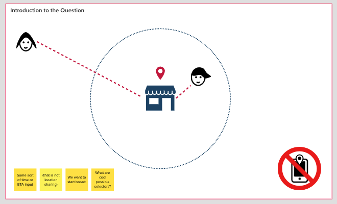
In Mural, I began by drawing a diagram with icons to try to visually explain the problem we were trying to design a solution for. We wanted to know: how can the store know just how far away a user is if they select "On My Way"?
If a customer who is 5 minutes away and a customer who is 45 minutes away both select "On My Way", how will the store know who is getting there first?
Still using the Discovery Mural, I wanted to guide my discovery participants through a fun persona creation and journey mapping activity.These "journey maps" aren't the traditional UX journey maps, which are often much more elaborate, but rather a quick activity for everyone in the room to have a conversation around what our persona is doing and the touchpoints they are hitting throughout the experience.
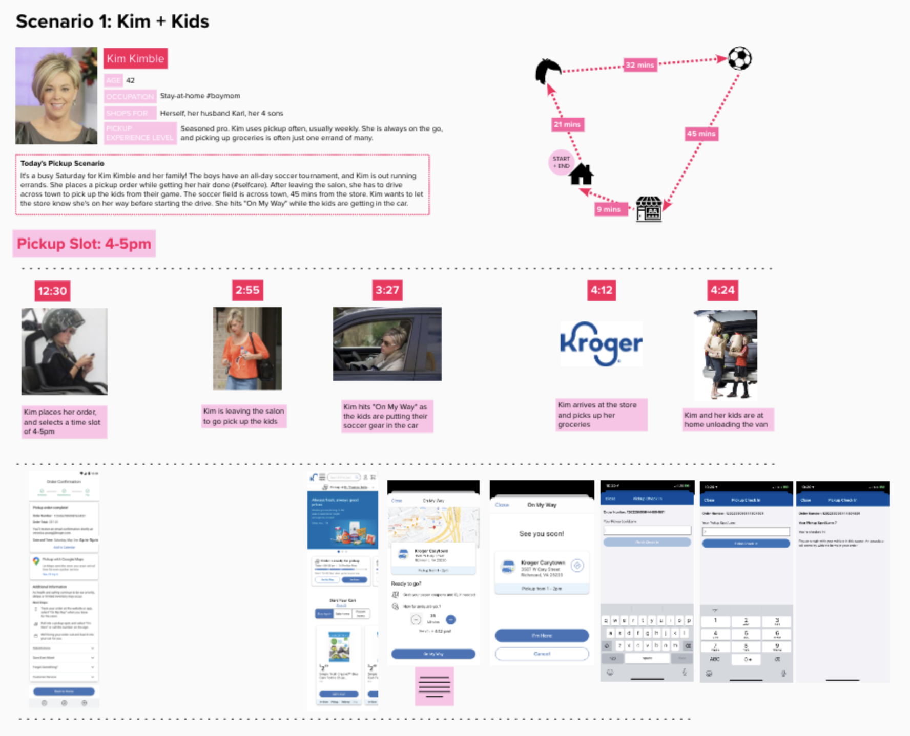
Scenario 1 is our ideal user for this use case: an experienced pickup shopper. She is 45 minutes from the store, and she is able to hit "On My Way" and say that she is 45 minutes away. She drives to the store, and her order is ready right when she pulls up.
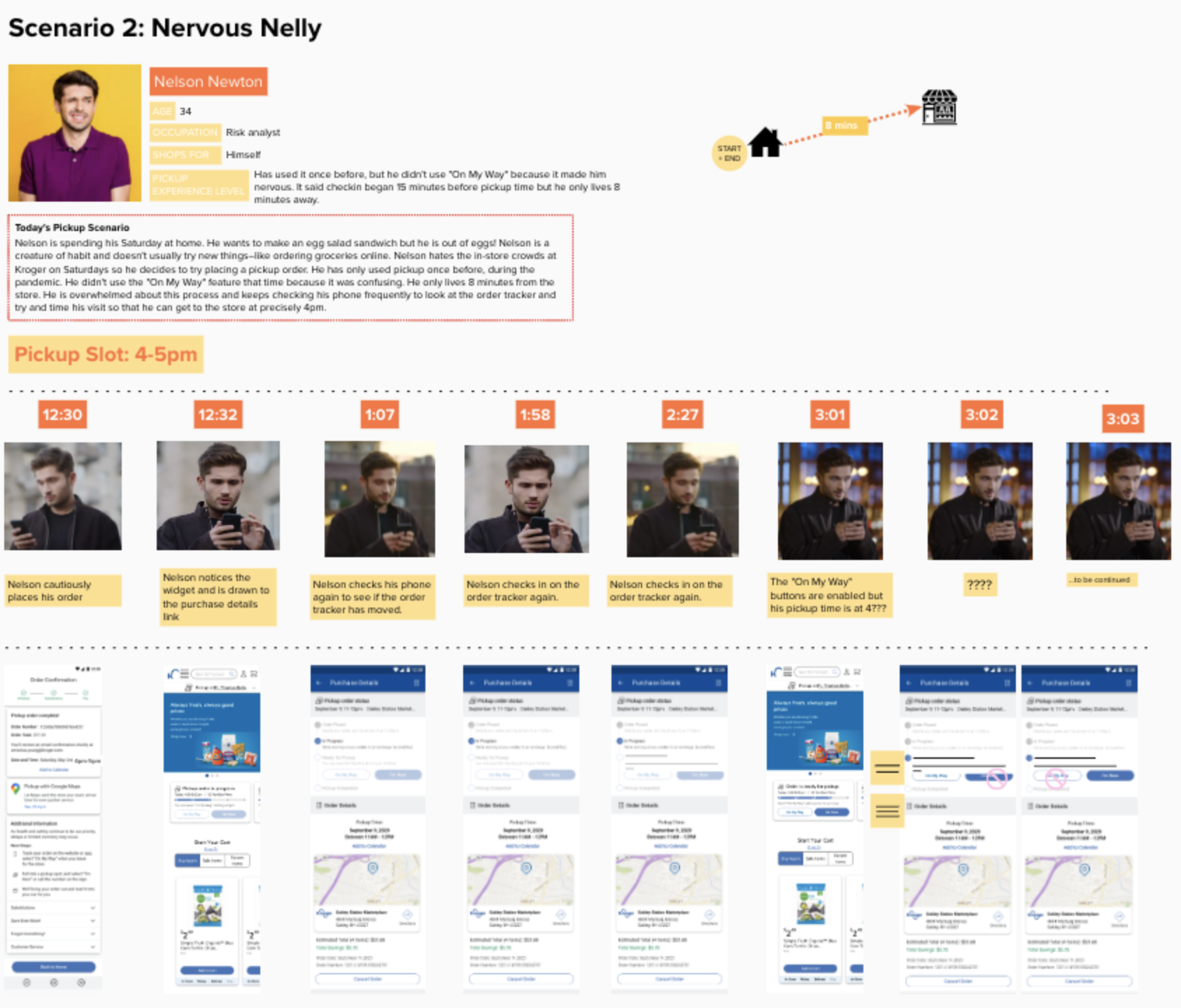
Scenario 2 is for a trickier use case: a first-timer. He is only 8 minutes from the store, so they're not sure whether to select "On My Way". The CTA is enabled before his pickup window starts, and this confuses him. He's not sure why he can select "On My Way" at 3:30pm, even though his pickup time slot is at 4 pm.
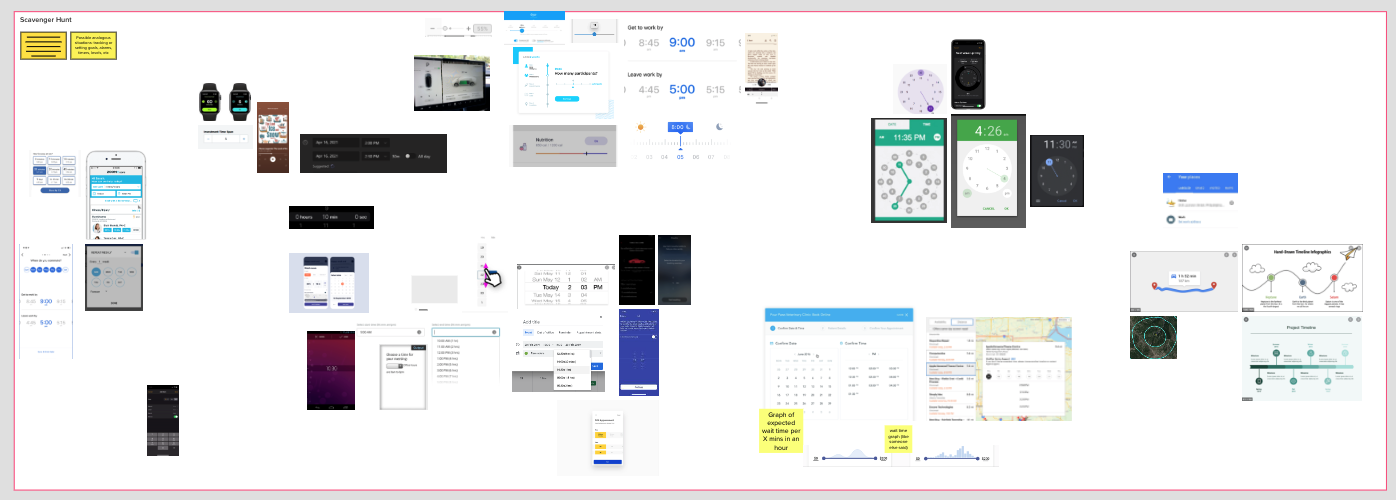
The next part of the Discovery was the "Scavenger Hunt". I've also heard this being called "Art Museum," or, more simply known as a competitive analysis. I set a timer for 20 minutes and had my partipants go and look for inspiration anywhere they could find it: another app that they use, Google images, Dribbble– anything goes. We specifically sought out data visualization / infographics / number displays that we could gather inspiration from. We wanted a way to visually indicate and select how many minutes away a customer is from the store.
After looking gathering inspiration in the Scavenger Hunt portion of the Discovery, it was time for me to set another timer– this time, to sketch our own solutions.
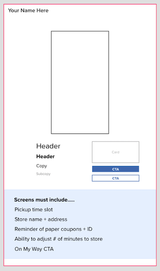
When I first began running Discoveries at Kroger, I would have people draw their sketches by hand, take a picture with their phone and upload it into the Mural. However, some people are self-conscious about their drawing abilities (or lack thereof) and it could prevent them from participating.
Another designer taught me this technique, using shapes and text from Mural to create the outline of a screen and click-and-drag components that are used as "building blocks" that a person can move into their screen to make a design of their own. This collaborative, on-the-spot group wireframing technique was a huge hit when I first implemented it.
My favorite part of this activity is when the timer goes off, and I see all of the unique ideas that each individual has come up with. I always start from the top left corner and have each person talk through their design. I've found that people are generally really happy to share what idea they had and what inspired them.After everyone gets to speak to their own design, I set another timer for 5 minutes and have everyone dot vote on elements of a design they think we should pursue in a next iteration. The dot votes create a heat map effect. Areas with the most dots will typically be included in the mockups.
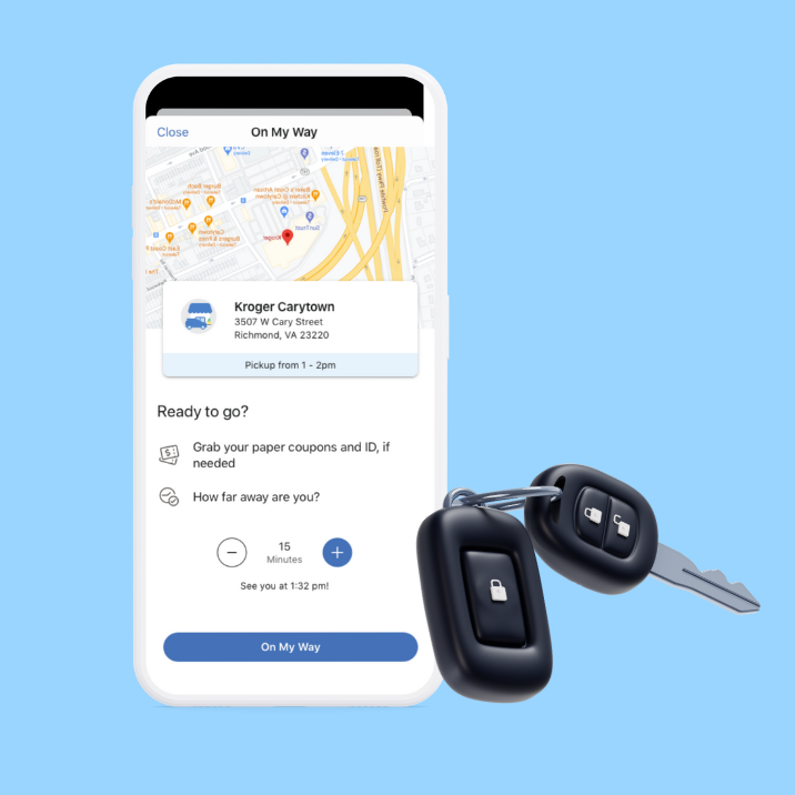
The next iteration of our On My Way screen was referred to as Variable ETA. Rather than having one CTA option that the user can only select if they are 15 minutes away, we built out a capability for the user to adjust their arrival time in 15-minute increments, the plus and minus sign stepper adjusts from 15, 30, 45, and 60 minutes.
By using this feature, if one user selects that they are 15 minutes away and another user selects that they are 60 minutes away, the store associates will see the ETAs, and know which order to begin preparing first. This benefits the customer by letting them get their groceries with minimal wait time, and benefits the business by quicker fulfillment rates and reduced complaints.
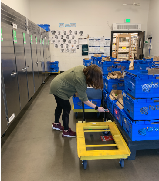
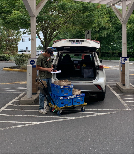
I went with another designer to interviewe store associates at some popular pickup locations. We asked them how it has impacted them to be able to see when each customer is arriving.
Overall, they said this feature made their jobs easier. The increased transparency helped them to prioritize.
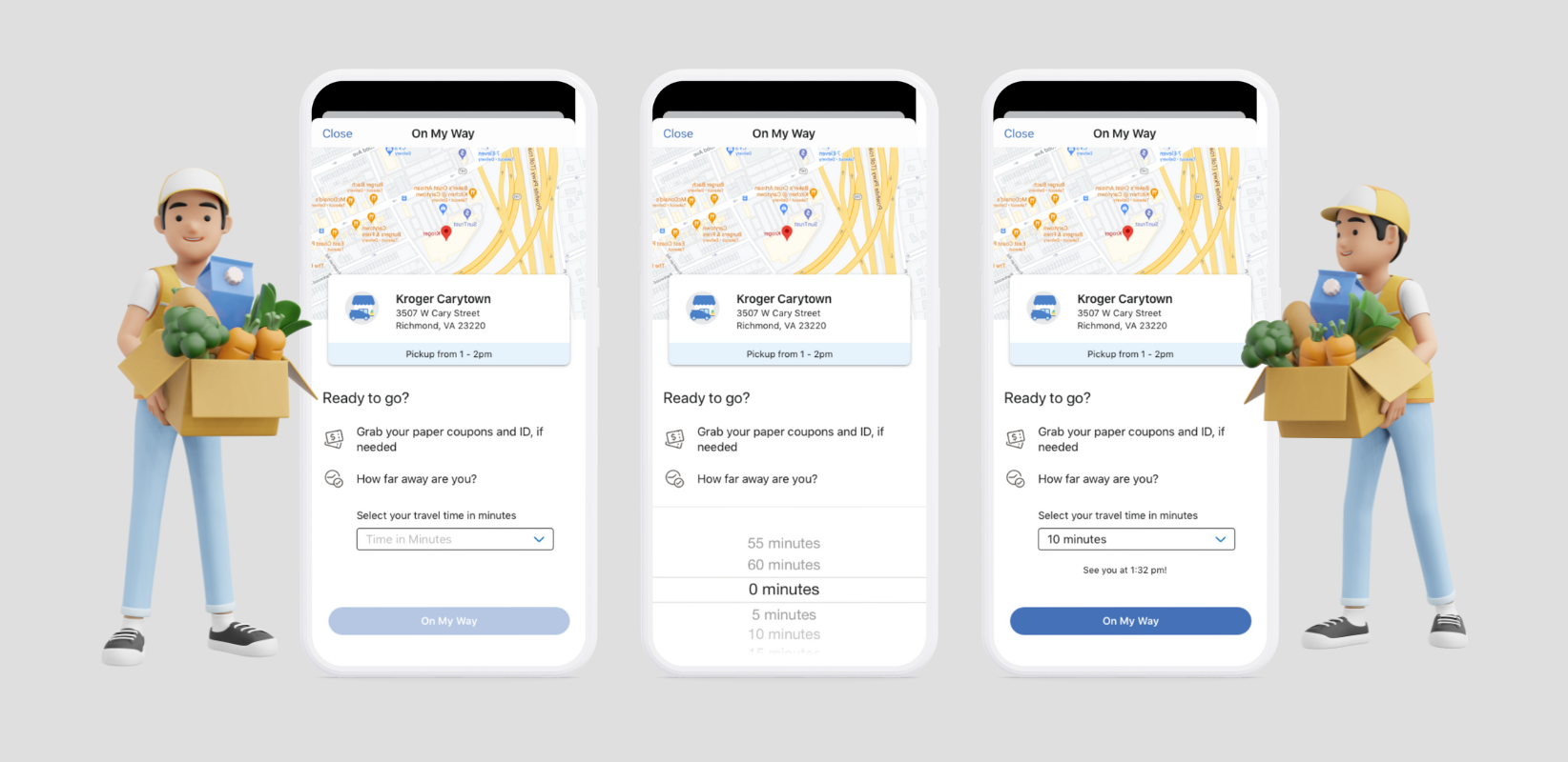
An issue that store associates brought to our attention: Some associates noticed that many people's ETAs indicated they were 15 minutes away, regardless of how far away they were. Some would arrive within 5 minutes, even if they said 15, and some wouldn't arrive for another hour. The reason for this is because the plus/minus stepper was defaulted at 15 minutes. We realized many users were simply hitting "On My Way" without interacting with the stepper.
The first time selector for Variable ETA (iteration #2) was a plus/minus stepper that was defaulted at 15 minutes. We learned that some users were Hitting "On My Way" without interacting with the stepper and adjusting their amount of minutes' travel time from the store.
To address this issue, I made the following tweaks:
This project was a career highlight for me. The pandemic revolutionized the grocery industry overnight, and I feel honored to have been a part of this technology revolution for grocery eCommerce. Although the frontline workers are the heroes in this story, I am glad I was still able to play a (smaller) role in keeping people safe. From a design standpoint, I learned a lot about the true spirit of MVP: launching light, putting out a quick solution, and then going back to iterate and improve. This was my first experience designing on such a tight deadline, and I learned to be agile, pivot, and work as a team to deliver a solution on time.