
This redesign aimed to create a more intuitive, modern, and user-friendly experience by addressing key usability gaps that made it difficult for users to understand the product, navigate search options, and find relevant parking efficiently.
Our focus areas included:
These improvements enhanced usability, improved conversion rates, and reinforced SpotHero’s credibility as a trusted parking solution.


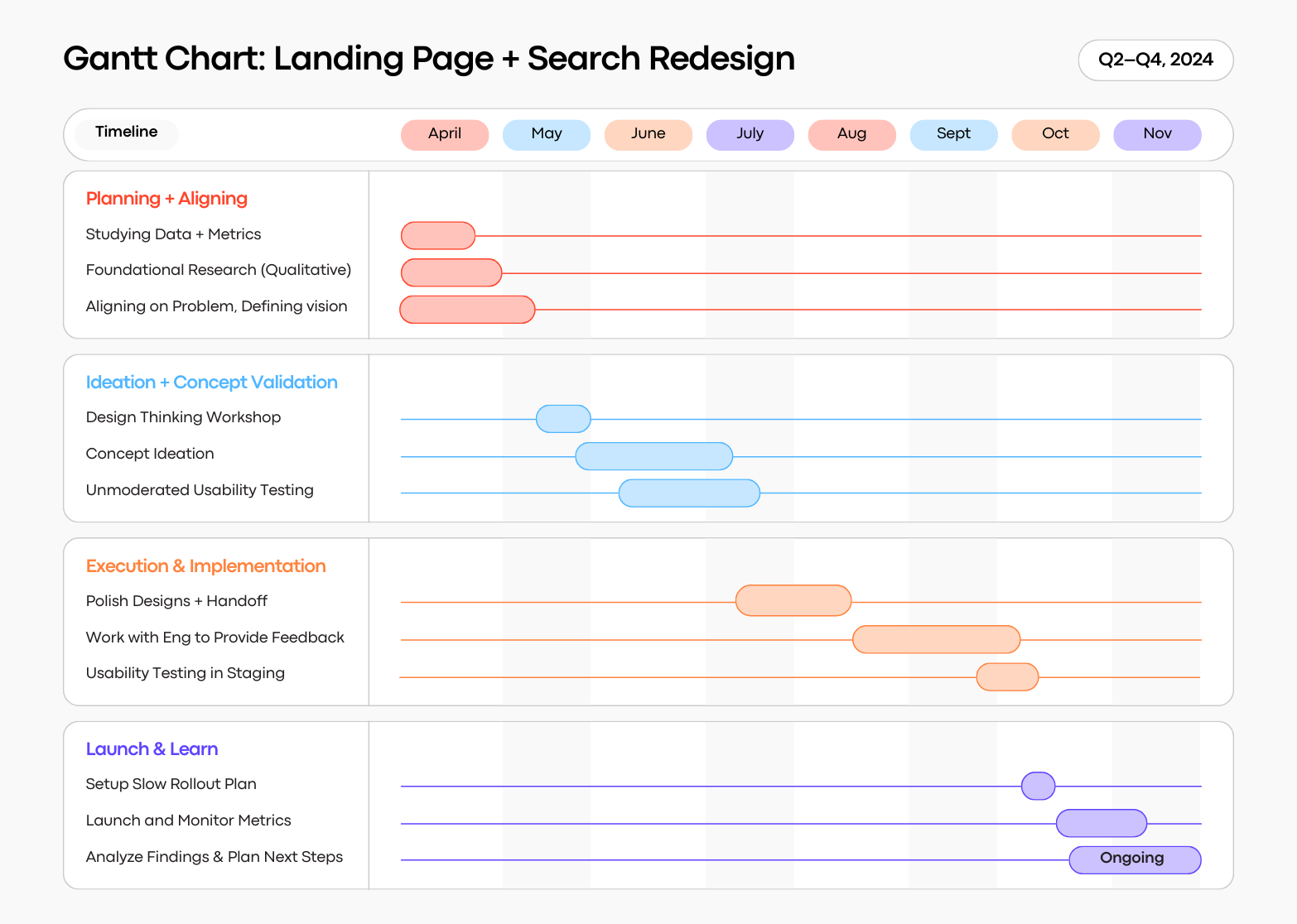
This project kicked off in April 2024, with Q2 focused on foundational research and ideation. During this phase, I gathered user insights, analyzed competitor experiences, and explored early design concepts. In Q3, I refined these ideas through concept testing and iterated on the design to improve usability and visual polish. By the middle of Q4, engineering brought the designs to life, turning research-driven decisions into a functional, user-friendly experience.
When deciding to prioritize this initiative, I experienced some pushback from stakeholders in regards to investing time and effort into visual enhancements or brand refreshes. Some stakeholders need more solid data to drive these decisions, and not just because "the designers think it looks bad." For this reason, I made it my mission to approach stakeholders with both qualitative and quantitative data as to why this visual refresh would be a sound investment in the long-term. I compiled some critical quotes from various user interviews I'd conducted over the past couple of years, and data from a perception survey to plead my case.

On more than one occasion, when I'd ask research participants who had never used SpotHero to give their honest first impressions of our home page, they would claim that it looked outdated, "sketchy", and like a scam.
I knew this critical word would make ears perk up in quarterly planning–scam. We can't move the needle on a first-time user acquisition metric if our site looks like a scam! I used these quotes as impetus for change.
In order to gather qualitative feedback about first impressions for SpotHero vs. other online parking services at scale, I created a survey on SurveyMonkey and sent it to 100 participants from their panel.
I showed the survey participants 5 landing pages with the company names and logos redacted, and asked a few straightforward questions:

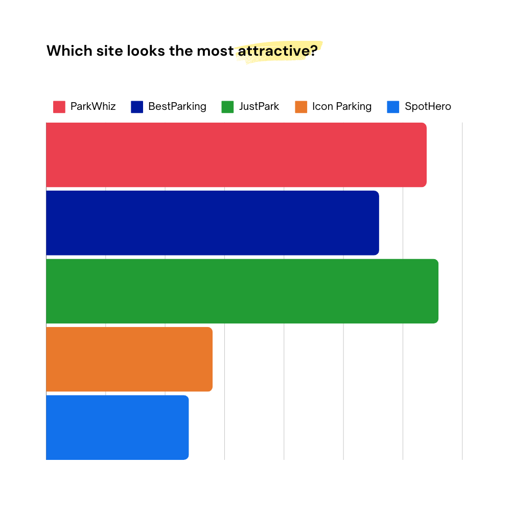

Leadership and stakeholders were initially skeptical that visual enhancements to the home page could have an impact on user behavior or conversion metrics, but after seeing this qualitative feedback and how we rank against our competitors, they were all in. From there, my product manager and I were able to prioritize the landing page refresh in our 2024 roadmaps.
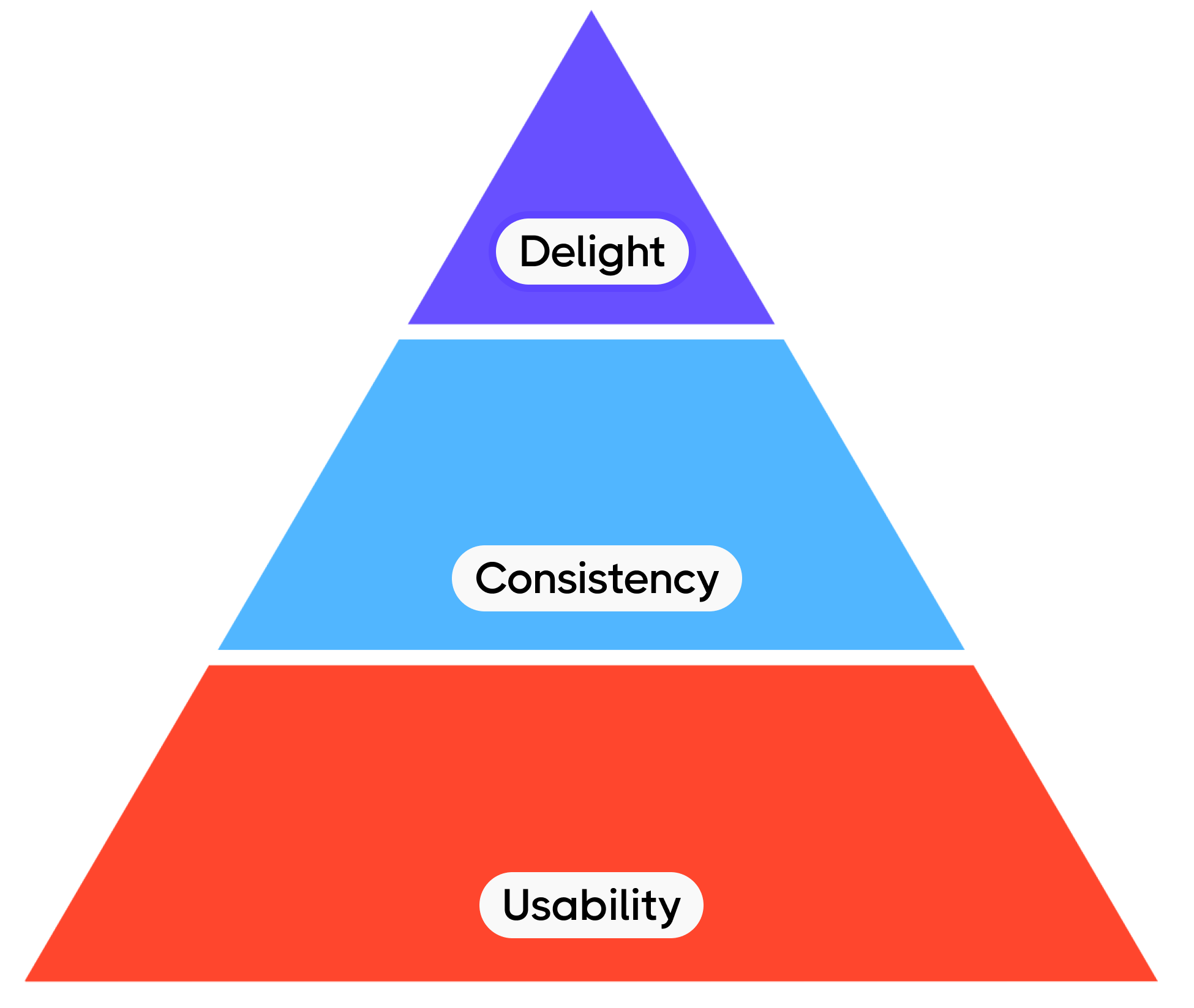
To guide the homepage and search entry point redesign, we structured our efforts around a 3-tiered pyramid framework:
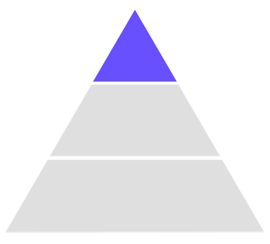
At the foundation was usability. I prioritized making the product intuitive and easy to use, ensuring that users could navigate the experience and find what they needed without friction.
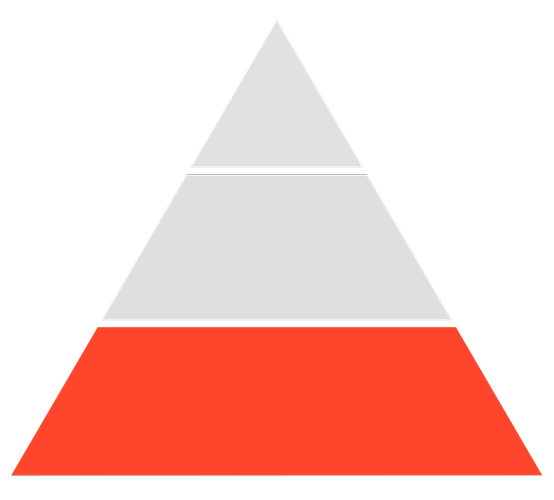
Building on usability, I aimed for consistency. This meant aligning the design and functionality of our web and native mobile platforms to create a unified and seamless search experience across all touchpoints and use cases.
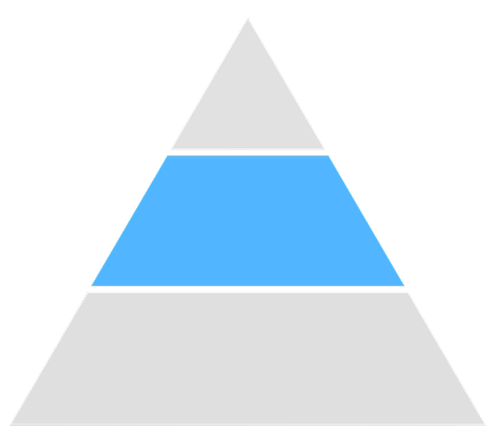
At the apex of the pyramid was delight. I sought to deliver a modern, visually appealing experience that exceeded user expectations.
Before redesigning the homepage and search experience, we needed to understand why users were struggling. By analyzing data, conducting user interviews, and running usability tests, we identified key friction points that contributed to low engagement and trust. Our research revealed usability gaps in the search flow, inconsistencies in the tab structure, and a lack of visual appeal—factors that were directly impacting user confidence and conversion rates.
Our data showed that web had a 33% higher bounce rate than the native apps. This was particularly concerning because over 65% of new users' first session is on web. Additionally, web users took 1.6 minutes longer to convert than app users, indicating a slower, more uncertain decision-making process.
By utilizing multiple generative research methods, we had enough qualitative and quantitative data to see distinct patterns emerge in all 3 areas of our pyramid framework.
Through moderated usability testing, we observed that new users struggled with search inputs. Without date and time selection on the homepage, they landed on results with irrelevant default settings, leading to confusion. Heat maps from unmoderated testing reinforced this, showing that users often failed to update dates and times, revealing a disconnect in the search flow.
Aligning web with the app by collecting full search details upfront became a clear opportunity. We also found issues with the homepage tab structure—users ignored the ‘Airport’ tab and simply searched for airport parking in the default “Hourly” tab. This highlighted an inconsistency: “Hourly” and “Monthly” were time-based, while “Airport” was a location.
Visually, the homepage left a poor first impression. Maze testers described it as untrustworthy, outdated, and uninviting, comparing it to an error message. The sparse blue hero section lacked branding, value props, and clarity—missing a critical chance to build trust and guide users.
With our research insights in hand, we translated key findings into user stories to clarify the problems we needed to solve. These stories helped us prioritize features and ensure the redesign addressed real user pain points, from improving search relevance to enhancing trust and usability.
.png)
To ensure SpotHero’s search experience met modern user expectations, our design team looked to industry leaders like Airbnb, Turo, Tripadvisor, and Expedia—platforms known for seamless booking flows.
We analyzed how they structured search inputs, handled autocomplete, and guided users. Key patterns, like intuitive date selection and personalized suggestions, were compiled into a FigJam board for comparison.This research helped us adopt best practices while tailoring them to SpotHero’s needs, ensuring a search experience that felt familiar, efficient, and easy to use.

After gathering inspiration from leading booking platforms, I facilitated a group sketching session with fellow designers and two product managers. Together, we explored different concepts for structuring search inputs and date selection, sketching out potential solutions in a FigJam board. We then voted on the most promising ideas, which I refined into low-fidelity prototypes for concept validation testing. This collaborative approach ensured we leveraged diverse perspectives while aligning on the strongest design directions.
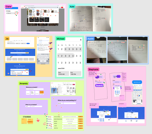
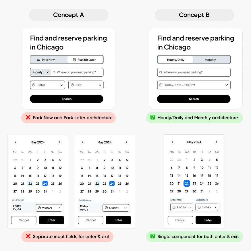
Building on our sketching session, I created prototypes of the top-voted concepts and tested them using Maze. I explored different date and time picker layouts and a revised tab structure, replacing “Hourly” and “Monthly” with “Park Now” and “Reserve Ahead.” Testing showed users preferred the original categorization, aligning better with their mental models. I also gathered feedback on visual preferences, with users favoring a cleaner interface with a single input field that opened a date and time modal over separate entry and exit fields, reinforcing the need for a streamlined experience.
As part of modernizing the search experience, I also made some changes to our aging design system. I conquered the steep learning curve of Figma's Auto Layout feature to update the library with new input fields, date and time picker components. These improvements not only enhanced the search experience but also provided a stronger foundation for future design scalability.
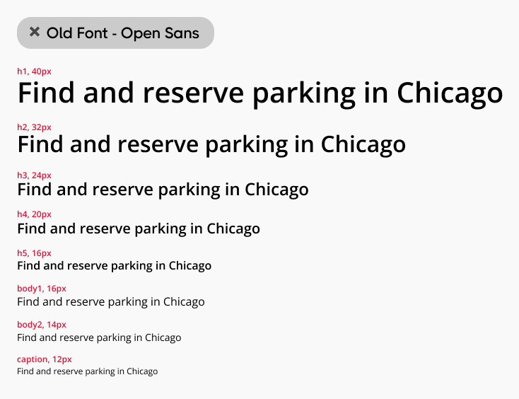
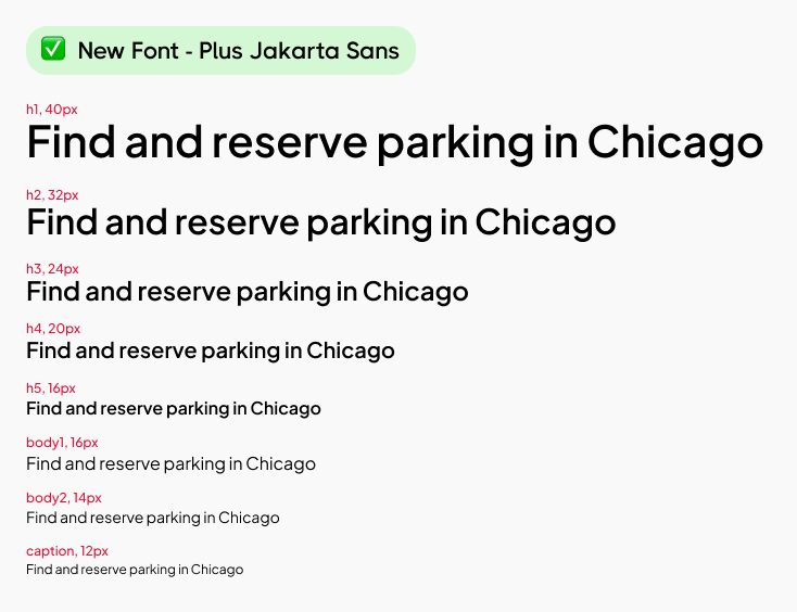
After much deliberation with the design and brand team, I updated the font from Open Sans to Plus Jakarta Sans.
I redesigned the input fields based on updated best practices. The label interaction follows Material's most recent update guidelines.

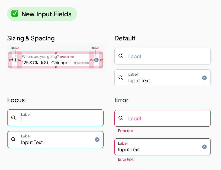
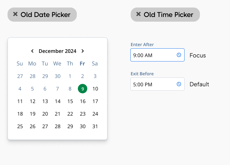
I modernized the date picker with a calendar inspired by the iOS design system and the time pickers to match the new input field components.

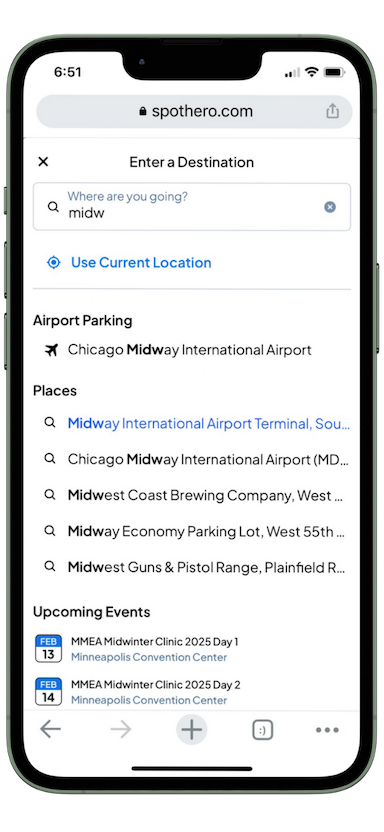
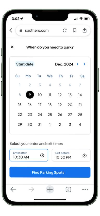
The final designs focused on making search more intuitive, efficient, and tailored to user needs. By refining the search input field, we made it easier for users to start their journey with personalized suggestions, recent searches, and location-based recommendations for airports and events. A redesigned date and time picker simplified the selection process, allowing users to set both entry and exit times within a single, cohesive modal. Additionally, we optimized event parking searches—our highest-performing vertical—by enabling users to search by venue and select the specific event they’re attending. These improvements streamlined the booking process, reduced friction, and aligned the experience with user expectations.


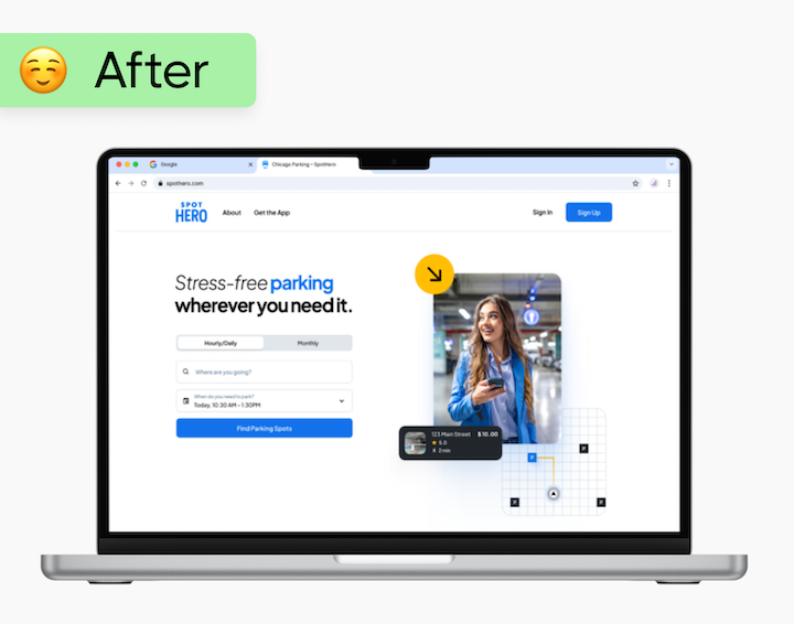
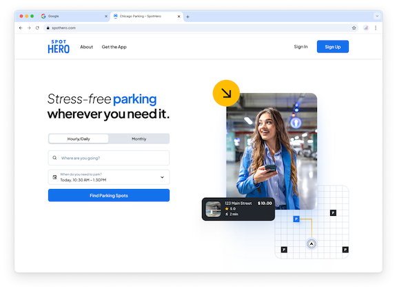
To create a more seamless experience across web and mobile, we aligned the homepage with our native app by asking users to enter their dates and times upfront, ensuring they see relevant search results from the start. We also simplified the tab structure, removing the Airport tab and refining the options to Hourly/Daily and Monthly, clarifying that users can book parking for multiple days—not just by the hour.Visually, the new homepage introduces a modern, polished aesthetic with updated design system components. A clean white background, high-contrast black text, and a refined color palette bring a fresh, contemporary look. We also incorporated a custom illustration to add personality and provide users with a clearer sense of what SpotHero offers. These enhancements not only improve usability but also make the experience feel more engaging and trustworthy.


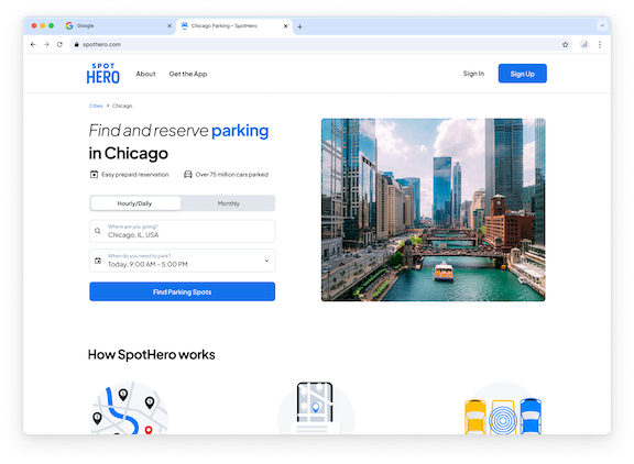
In addition to the homepage, we applied the new search experience to our SEO landing pages, ensuring consistency across entry points. These pages greet users with location-specific imagery—like a Chicago skyline for “parking in Chicago”—while maintaining the same modernized search components for a seamless experience. By aligning these pages with our redesign, we improved both usability and search engine optimization.
Given the scale of this overhaul, engineering collaboration was crucial to ensuring the final product matched the design vision. I worked closely with engineers throughout the build, reviewing implementations and providing feedback to maintain accuracy. With such a high-impact change, I also enlisted other designers and product team members to help scrutinize the experience, catching visual inconsistencies and potential usability issues, and ensuring all components passed accessibility checks. QA was a major focus, especially with the new date and time components, which introduced significant risk for bugs. Any issues in this critical flow could have a direct impact on conversion. Once everything was validated, we rolled out gradually, starting with 25% of users to monitor for potential gaps before expanding to the full audience.
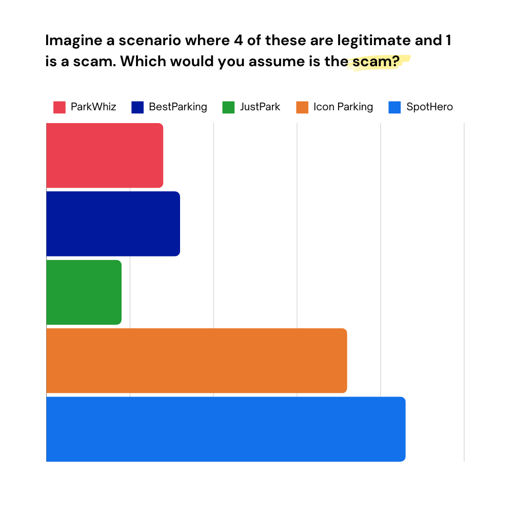
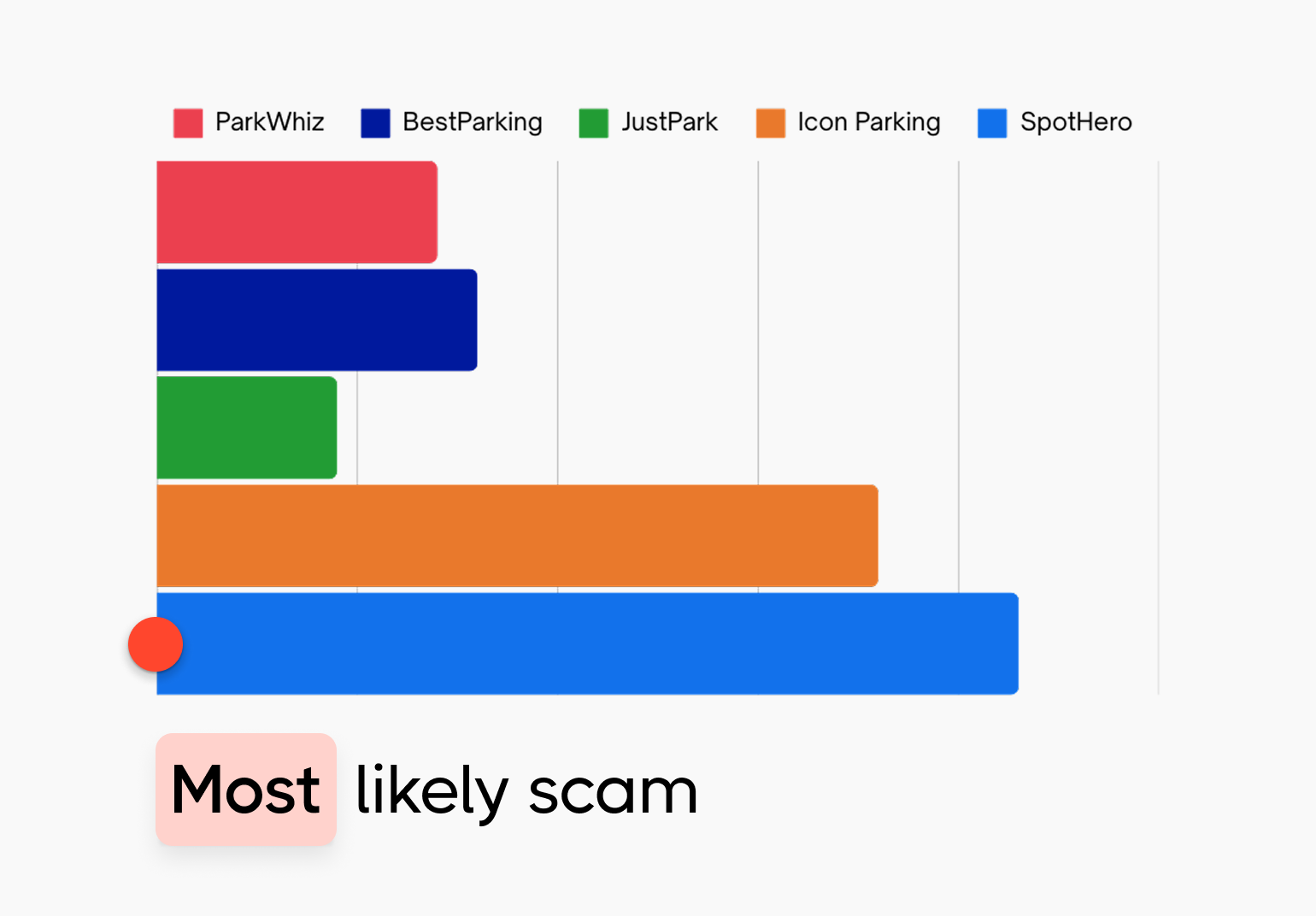
To assess the impact of our homepage redesign on perceived trust, I conducted a survey in June 2024 with 100 randomly recruited participants. I showed them five homepage designs—including SpotHero’s—blurring out logos and names. Participants were told that four were legitimate businesses and one was a scam, then asked to guess which site seemed least trustworthy. The original SpotHero homepage was most frequently selected as the potential scam.
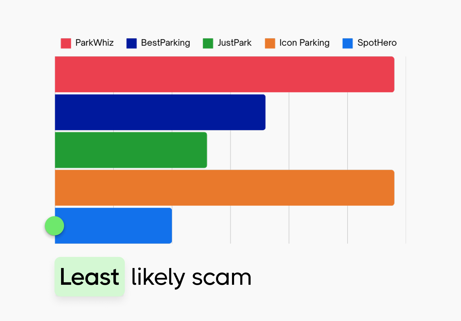
In July 2024, I repeated the survey with a new group of 100 participants, keeping everything identical except replacing the old SpotHero homepage with the redesigned version. This time, SpotHero was the least likely to be perceived as a scam.
This shift in trust perception highlighted the power of modern, polished design in shaping user confidence. The results resonated with stakeholders and leadership, reinforcing the value of visual credibility in driving user trust and engagement.
Since launching the redesign, we’ve seen a 13% decrease in bounce rate, indicating that users are more engaged with the new experience. While conversion rates haven’t shown statistically significant changes yet, this aligns with our expectations. This project was always intended as a long-term investment, modernizing and optimizing the foundation for future growth. By improving usability, consistency, and trust, we’ve set the stage for continued enhancements that should drive impact over time.